QSR mobile app
The ask was straightforward, rebuild a fractured and aging mobile ordering system that would take the first step in catching up with more agile and innovative competitors. Along the way, include important features such as loyalty rewards systems, pay and earn, location finding, and an intuitive user friendly ordering system that is a pleasure to use.
My Role
Interaction Designer
Team Composition
Design director, project manager, lead interaction designer, art director, 3 interaction designers, 3 visual designers, 2 production designers, 5 developers
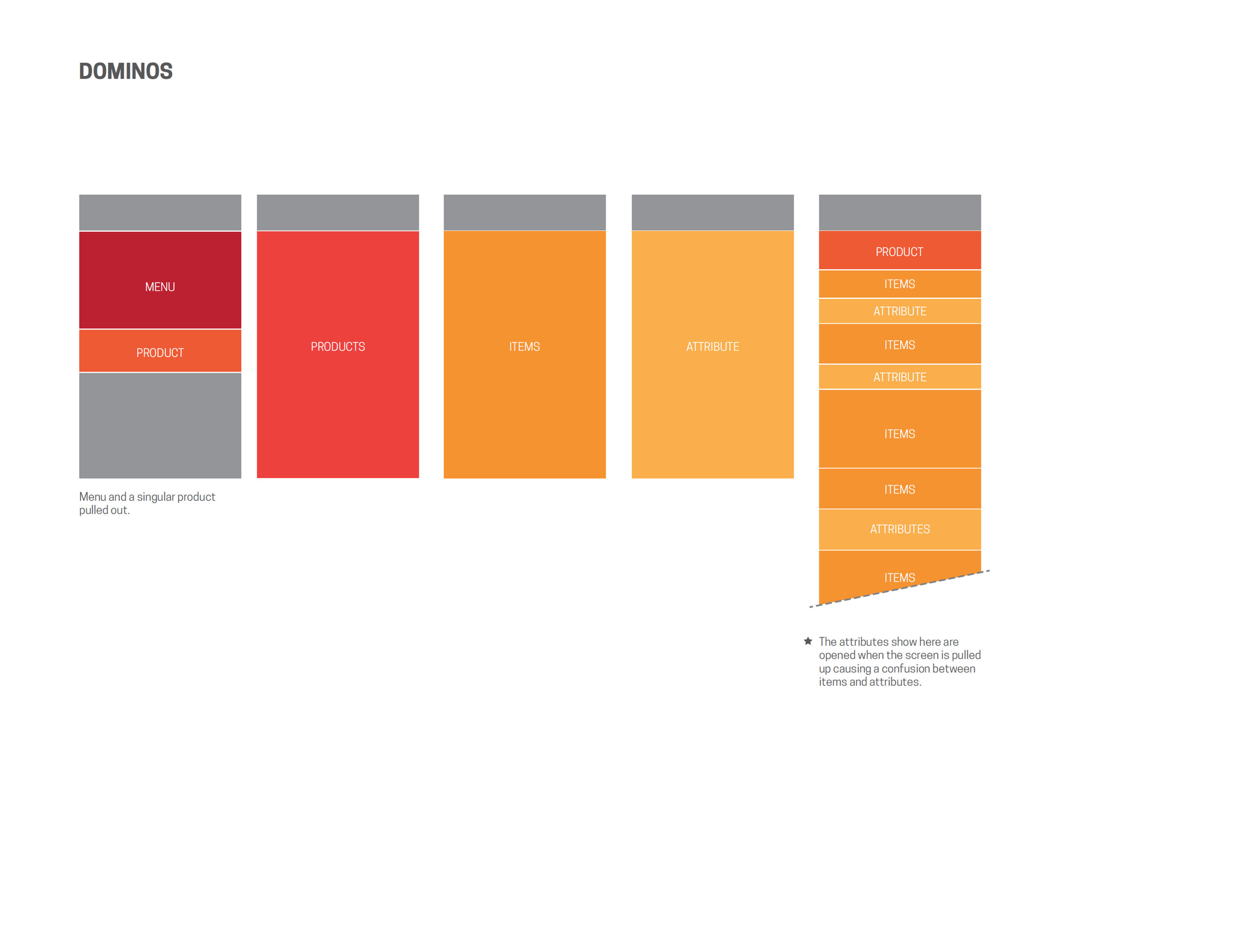
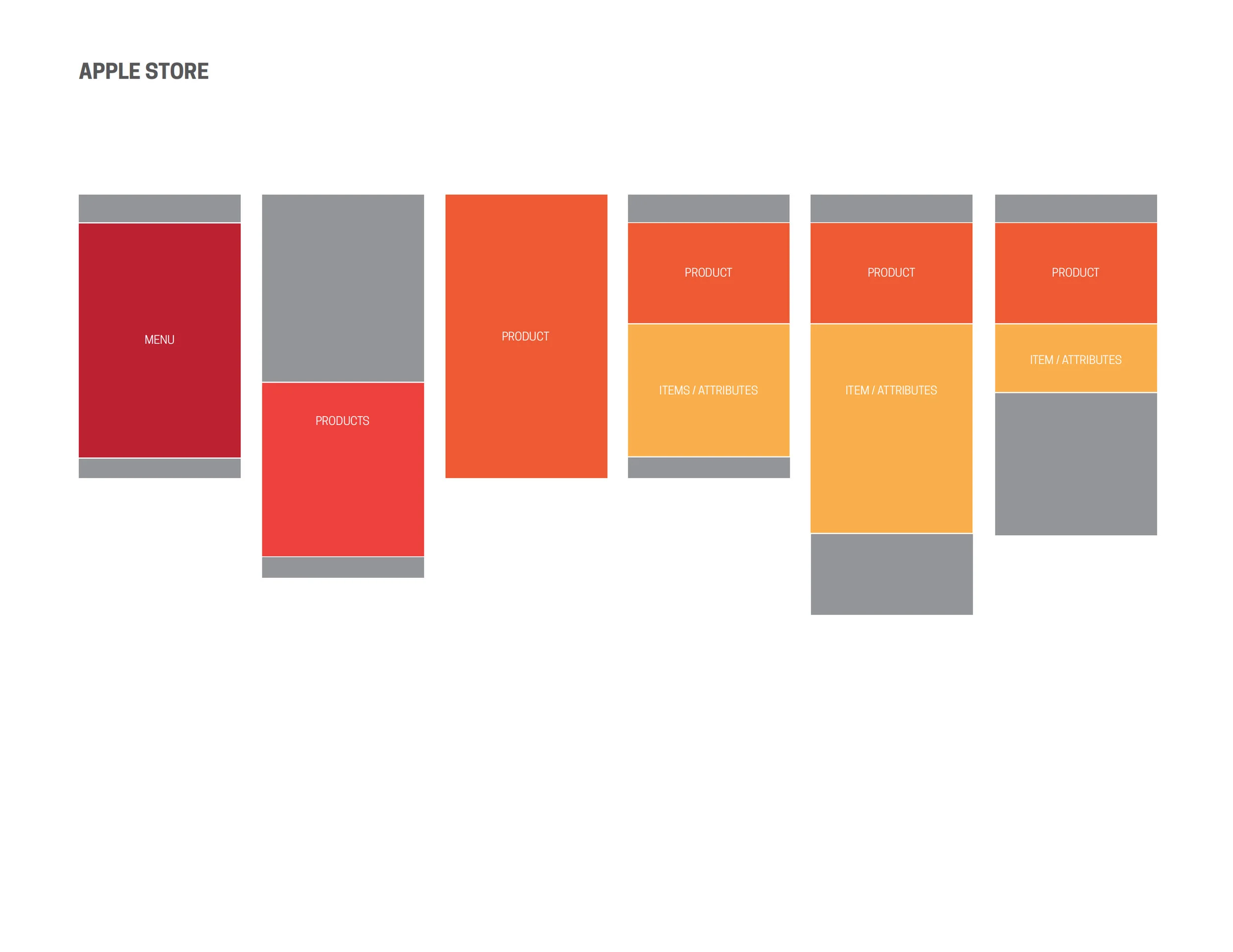
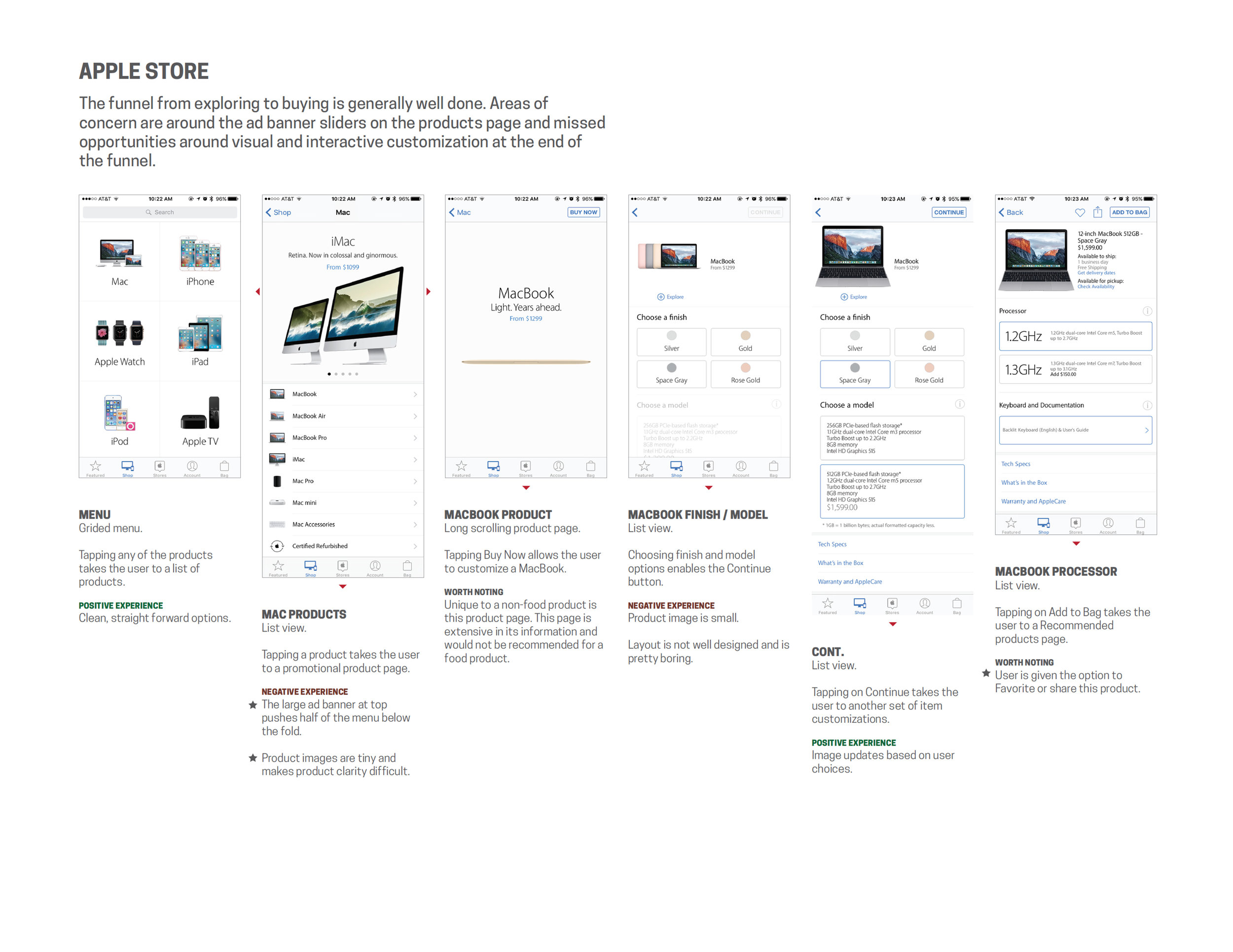
Checking out the competition
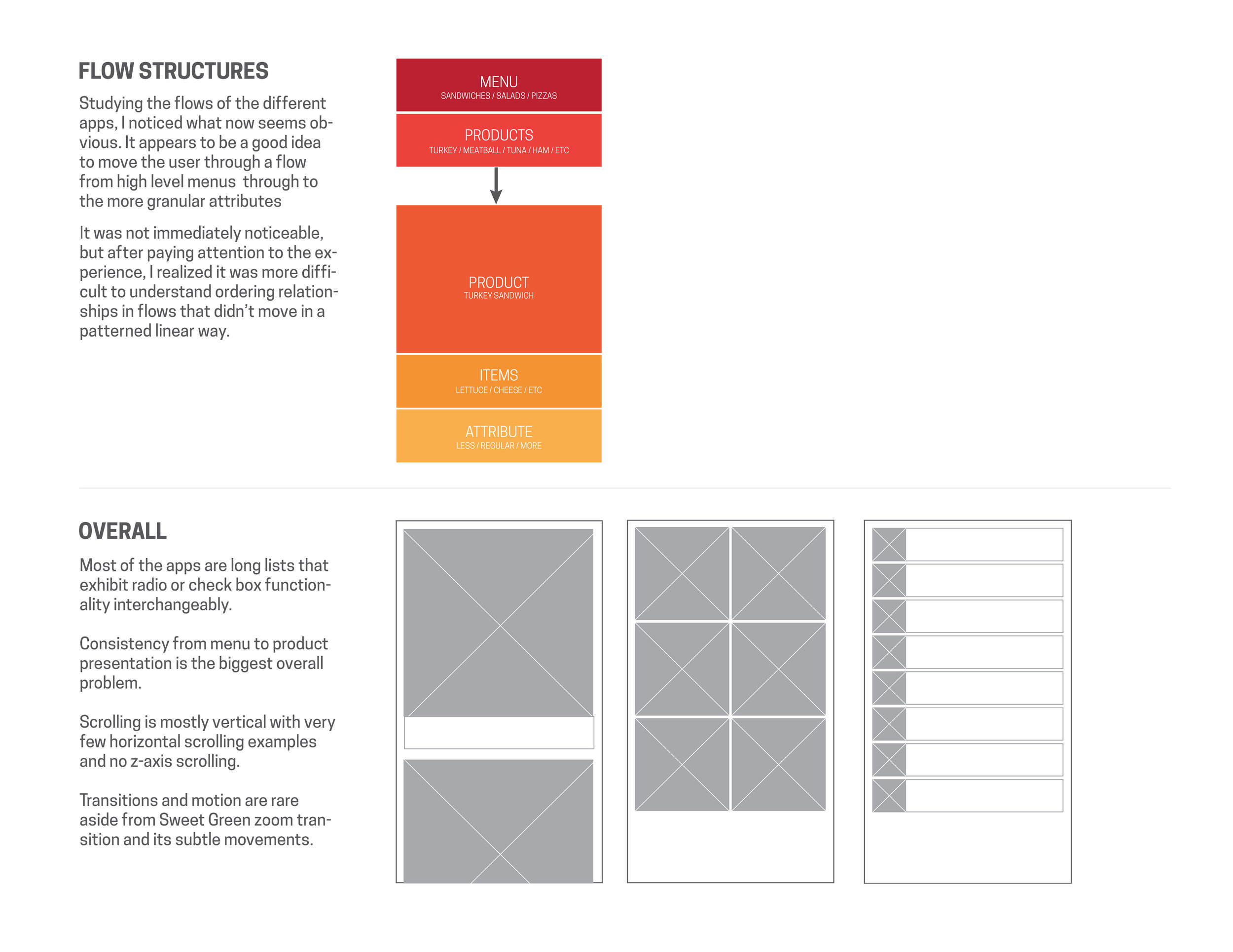
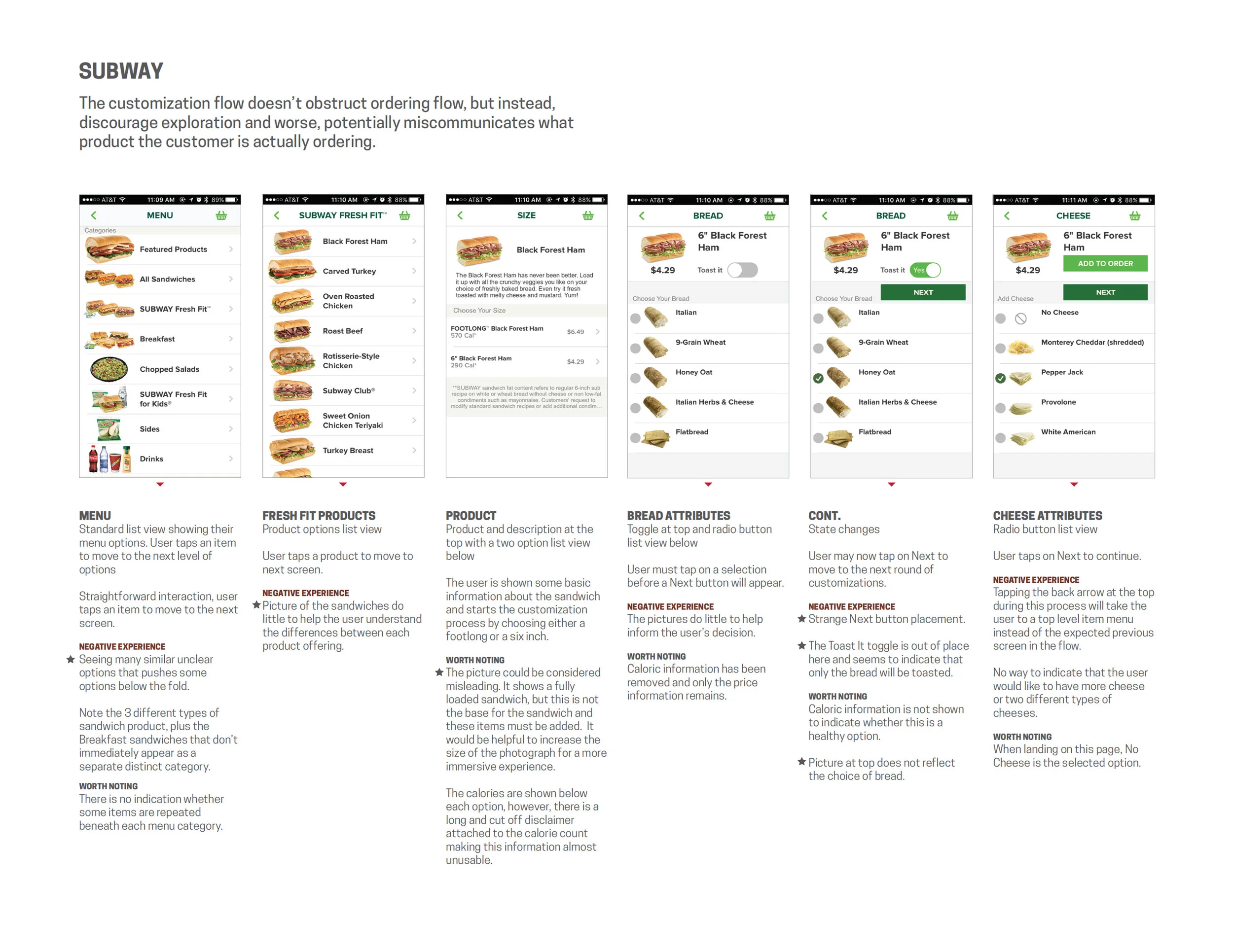
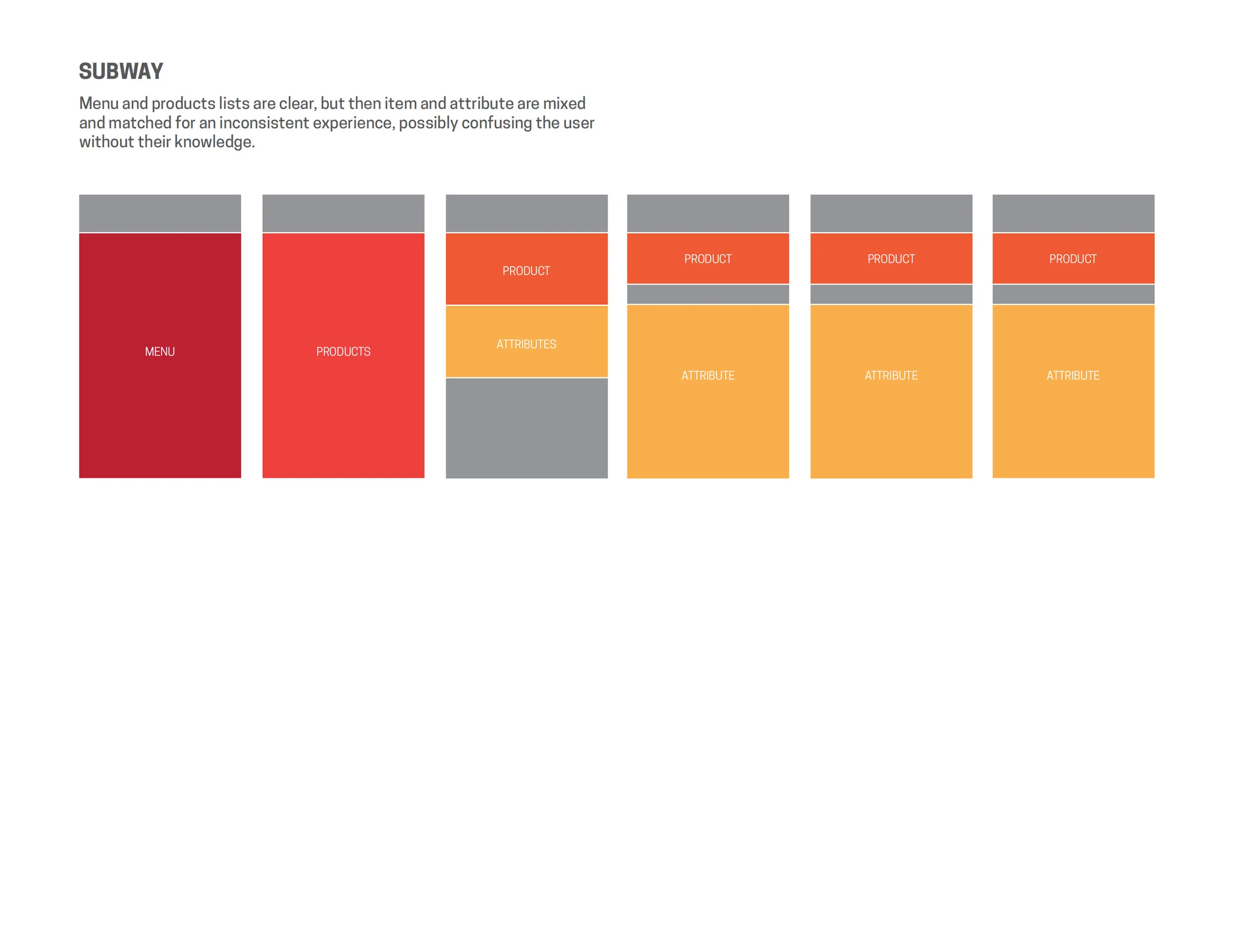
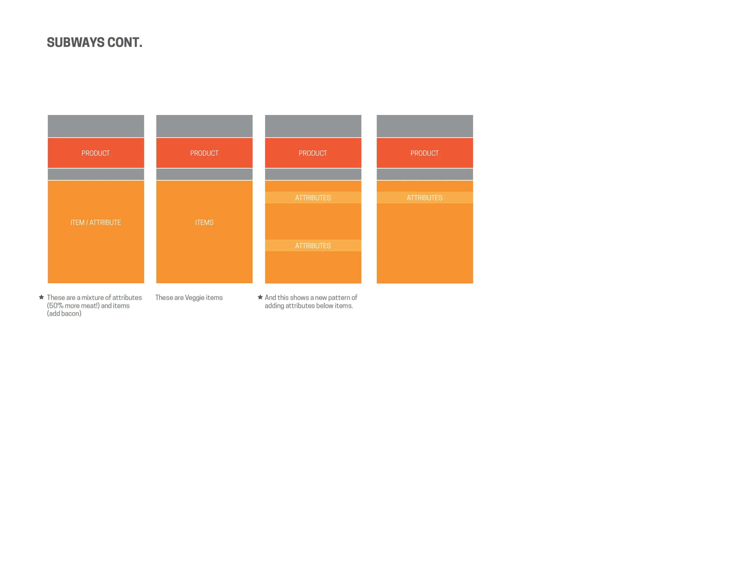
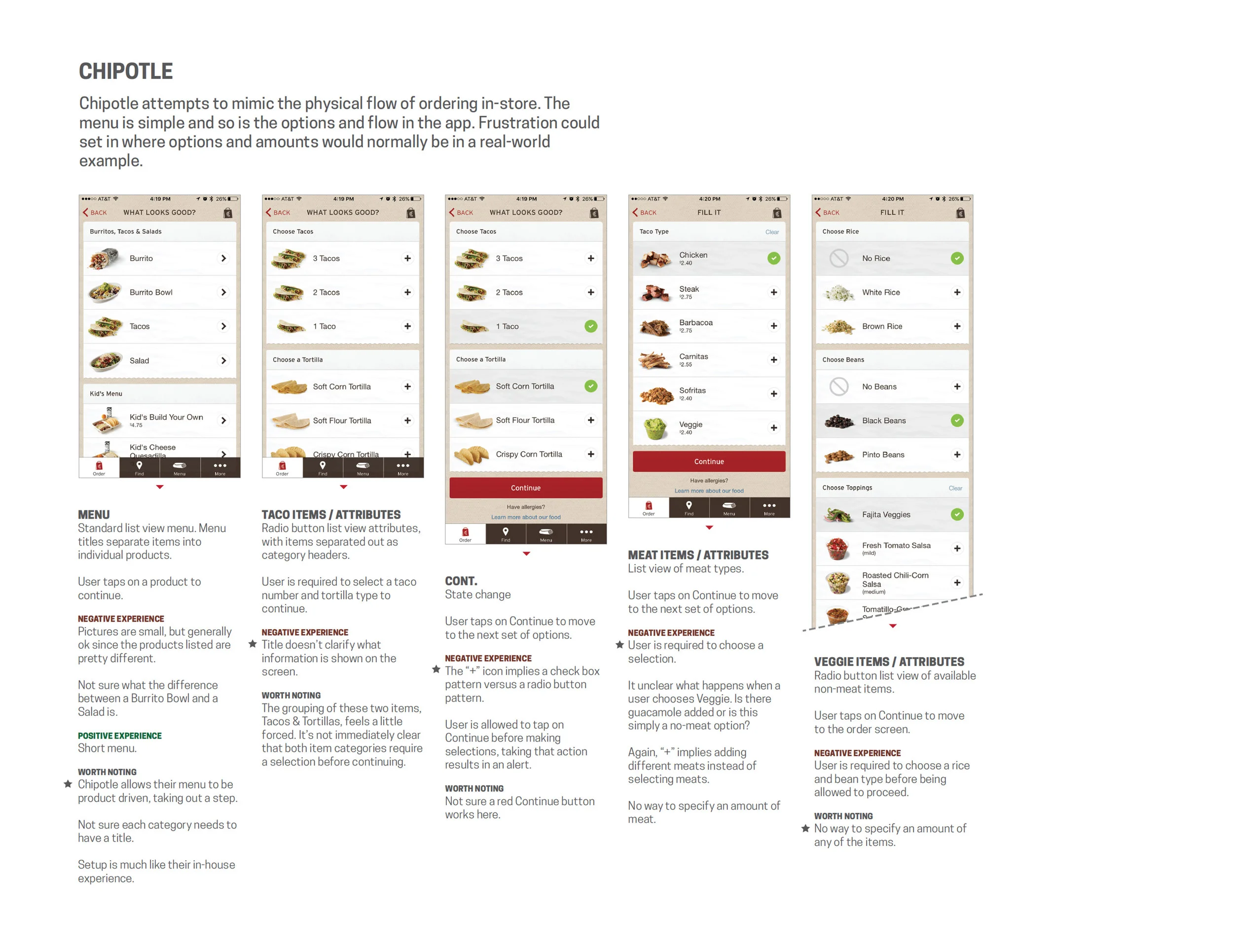
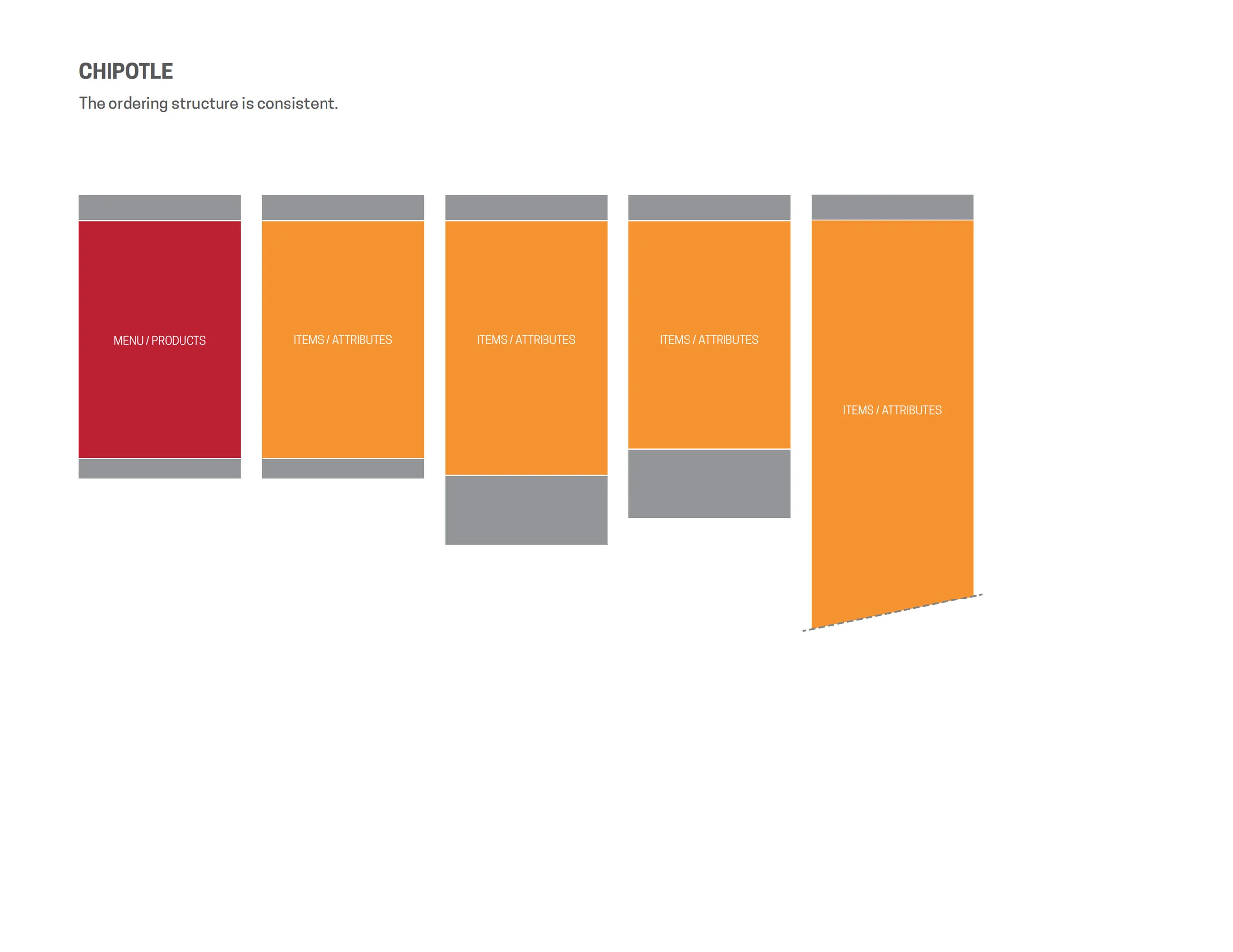
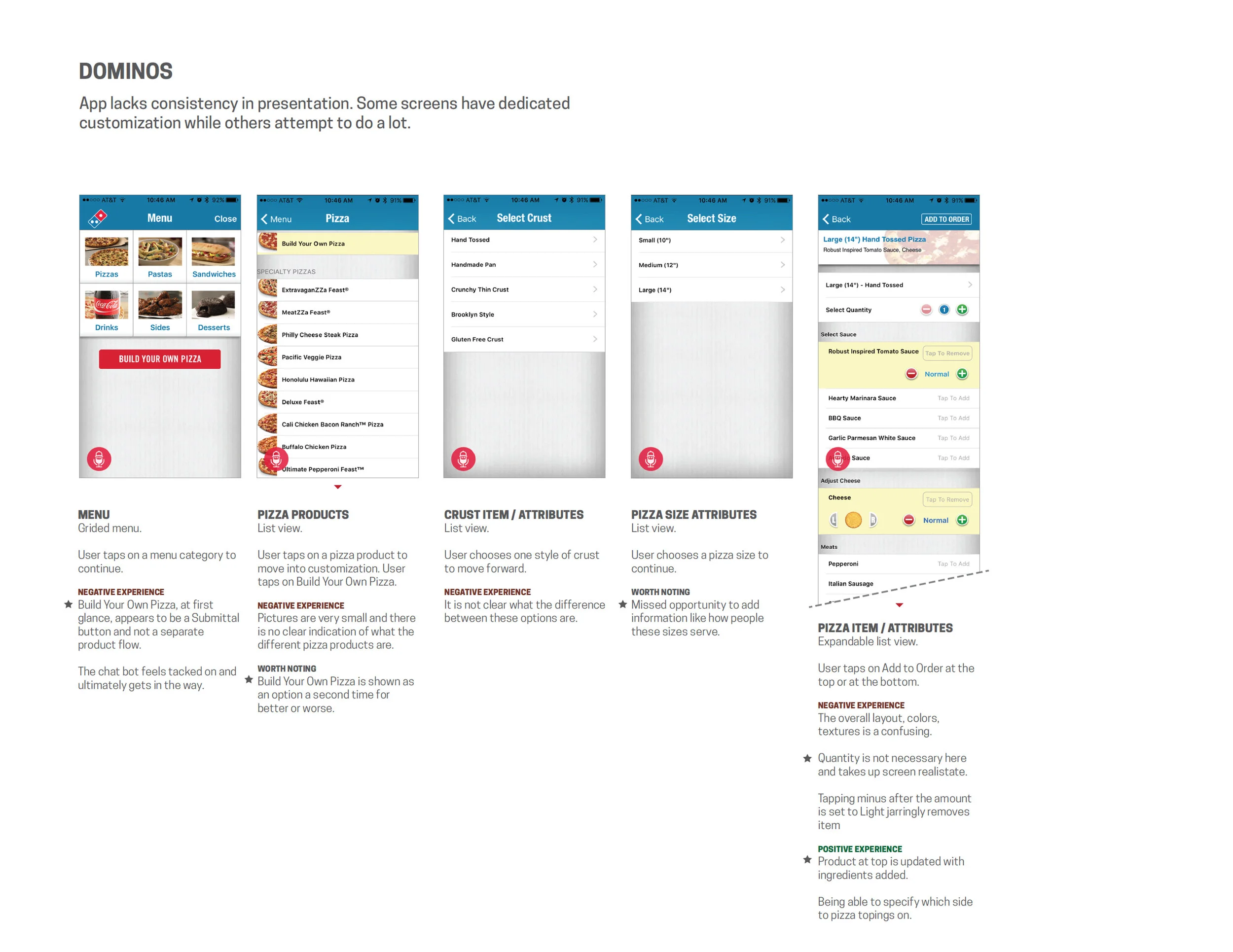
I conducted a thorough competitor analysis that not only looked at direct competitors but also experiential competitors. I analyzed their ordering process, their presentation process, down to how attributes were changed and manipulated. This gave us a broad guide and borders to which we could look to as we built out our experience.

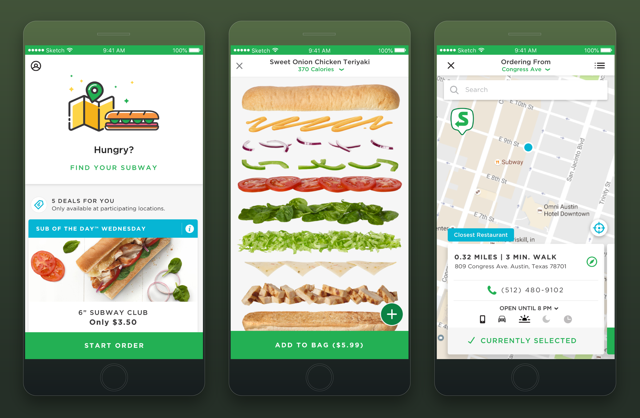
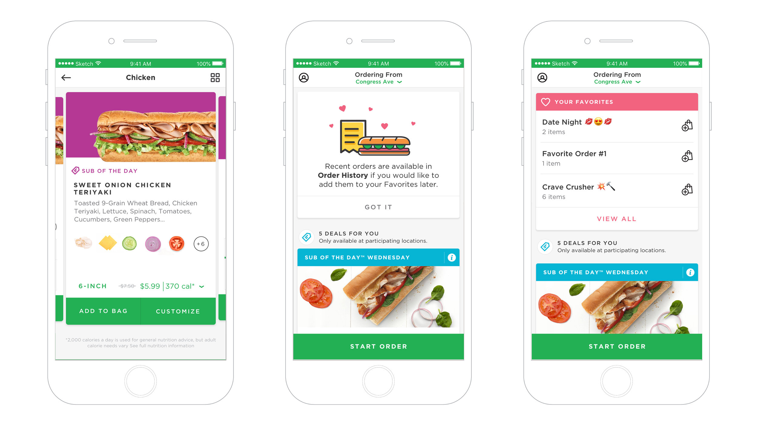
The new sandwich artist
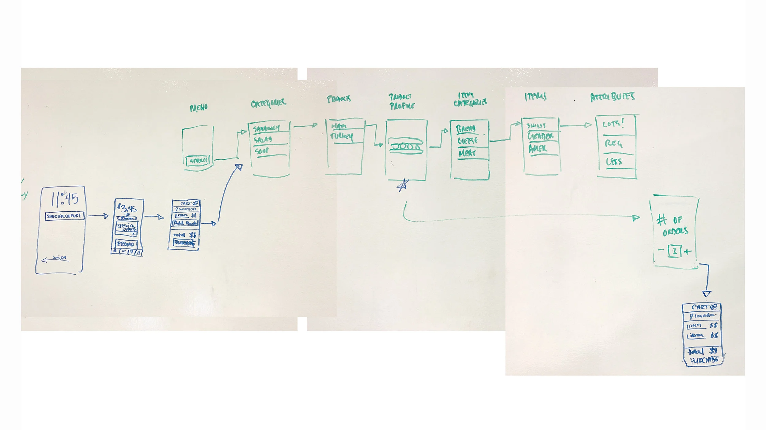
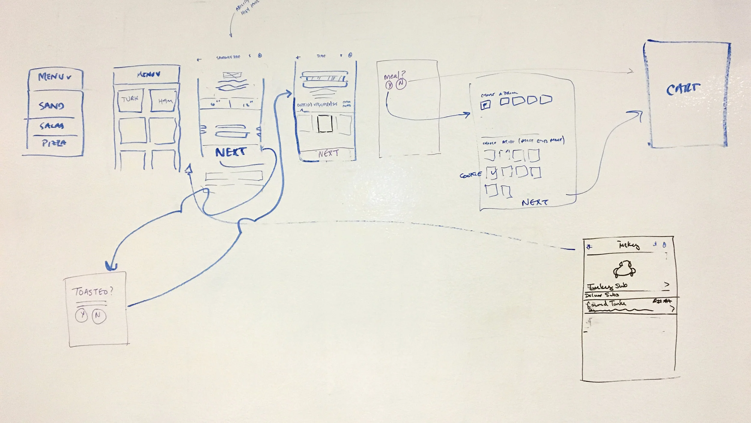
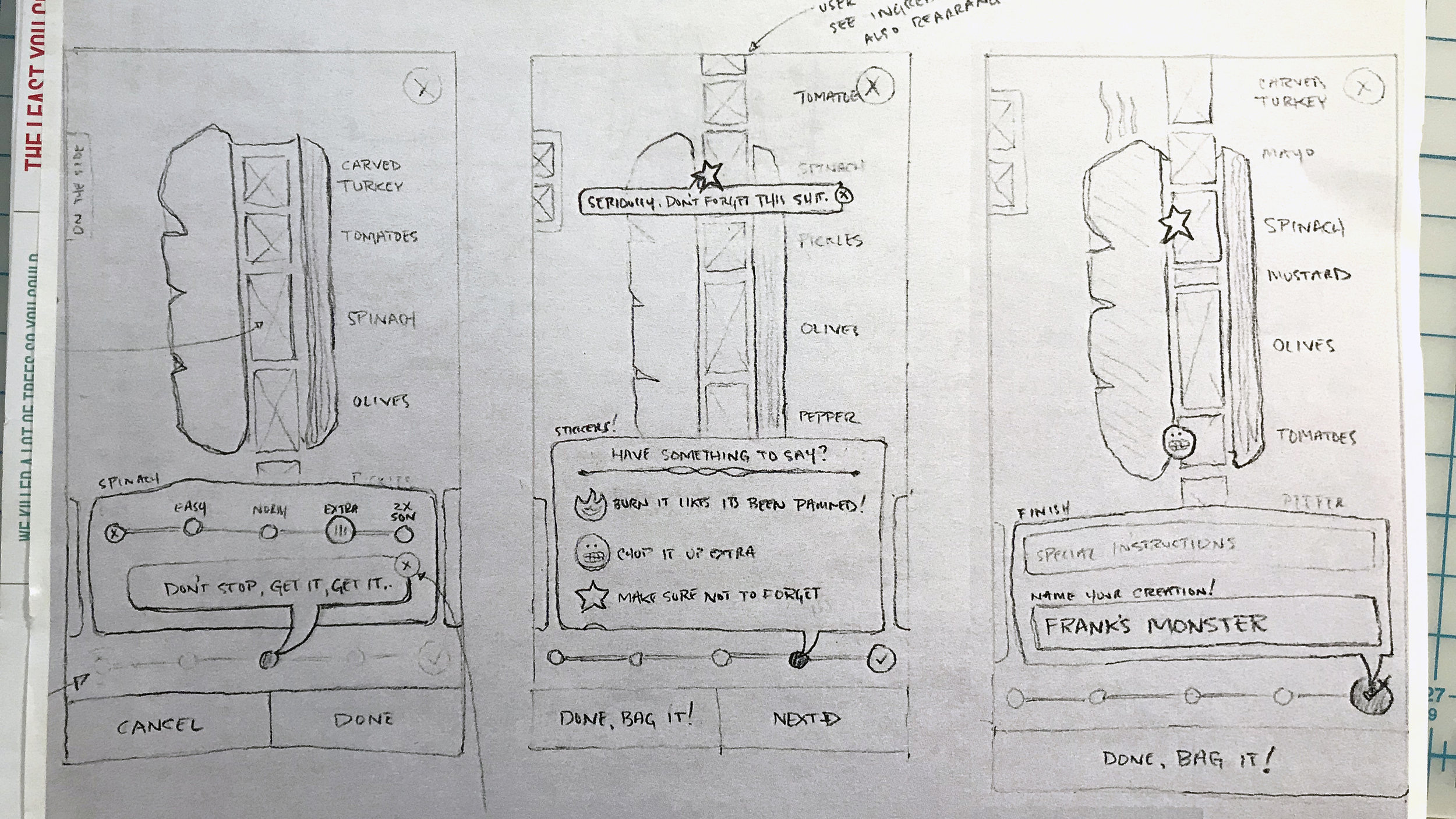
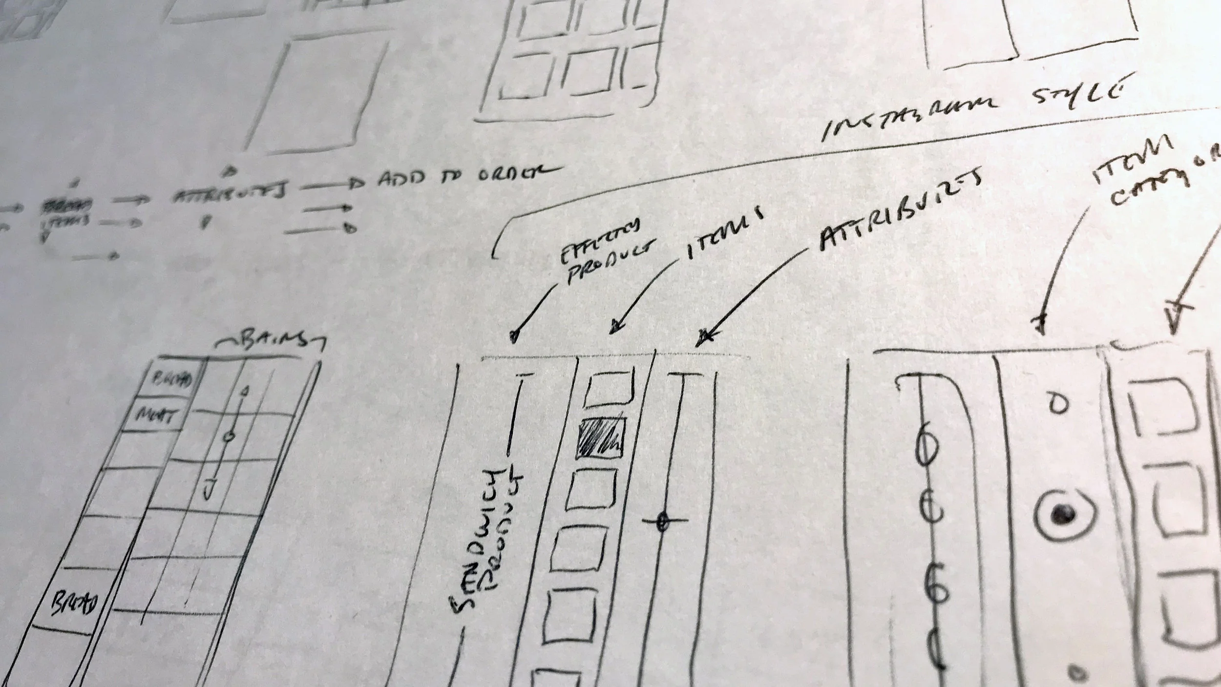
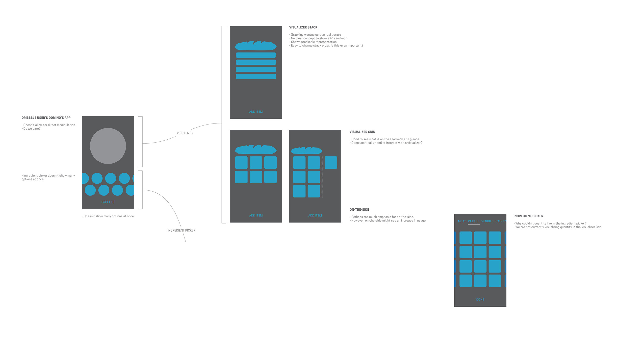
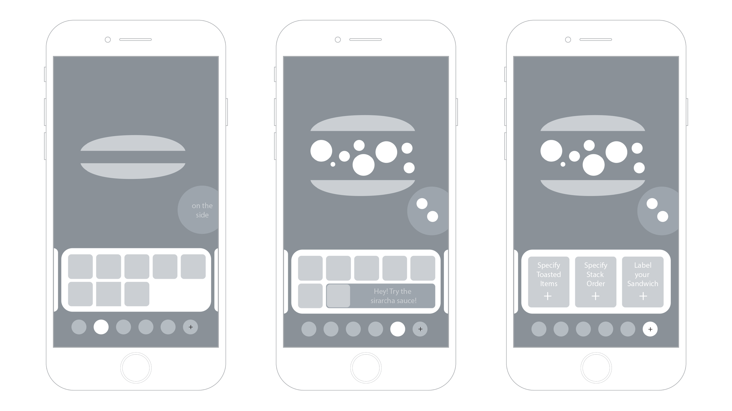
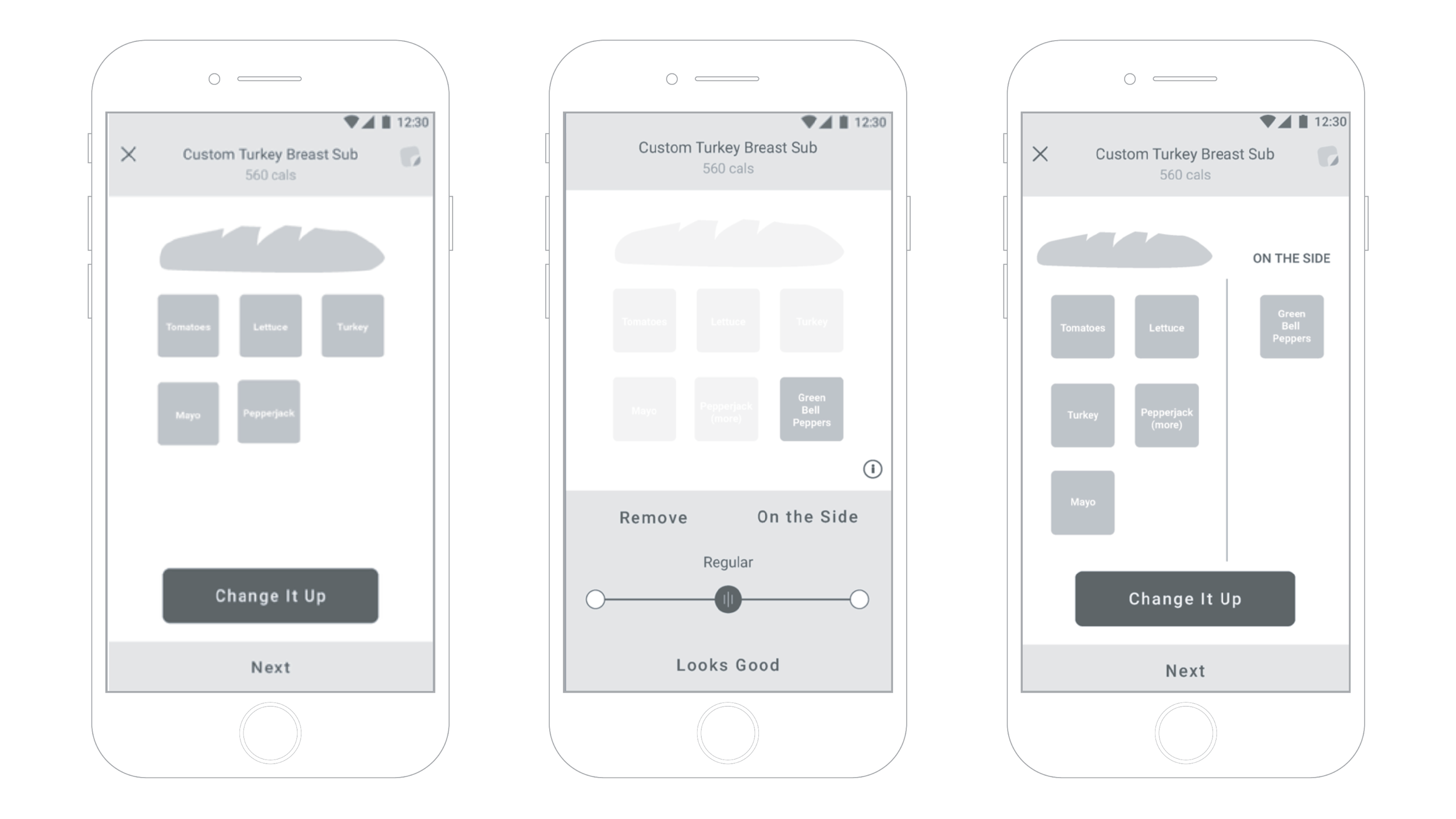
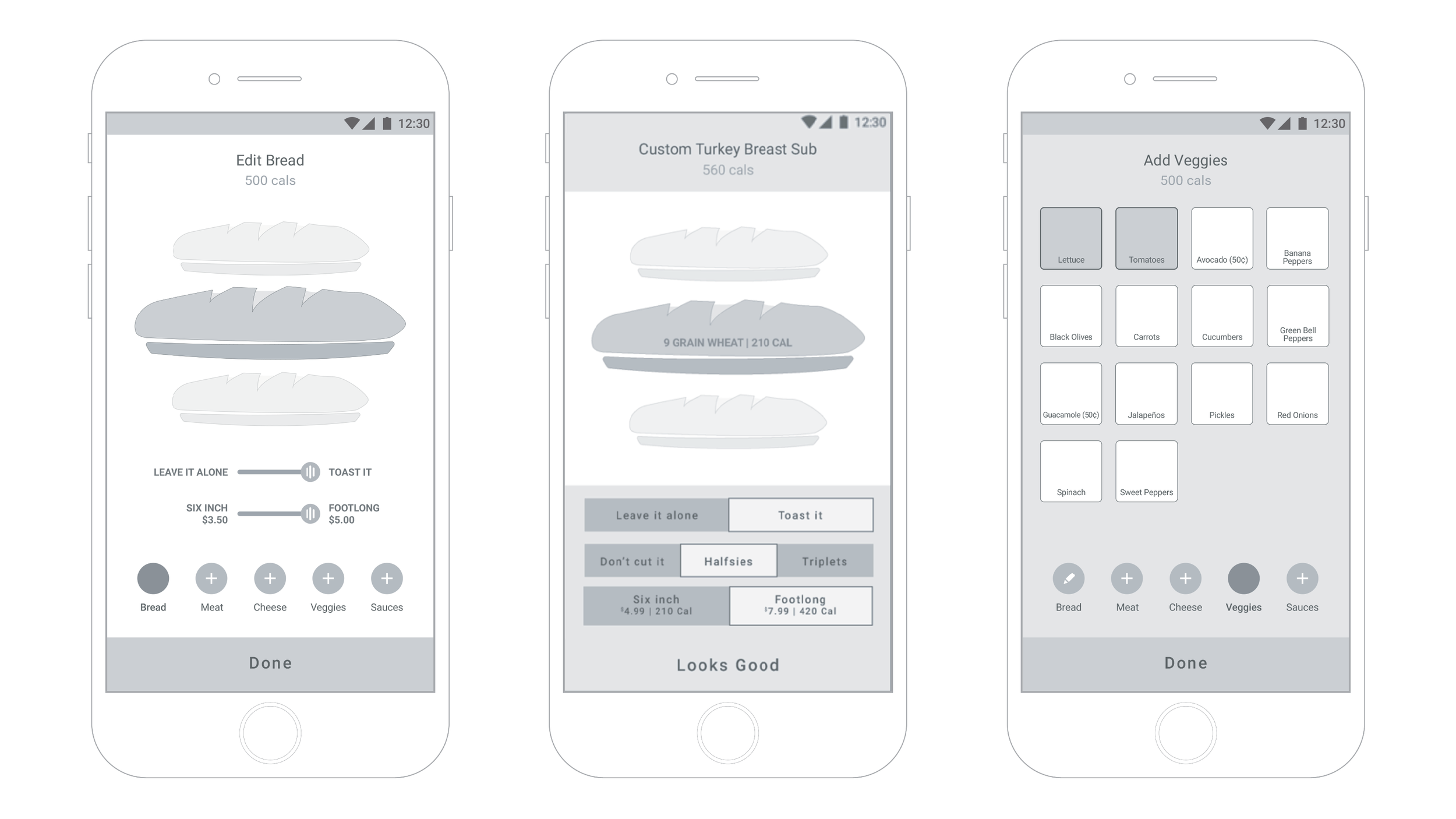
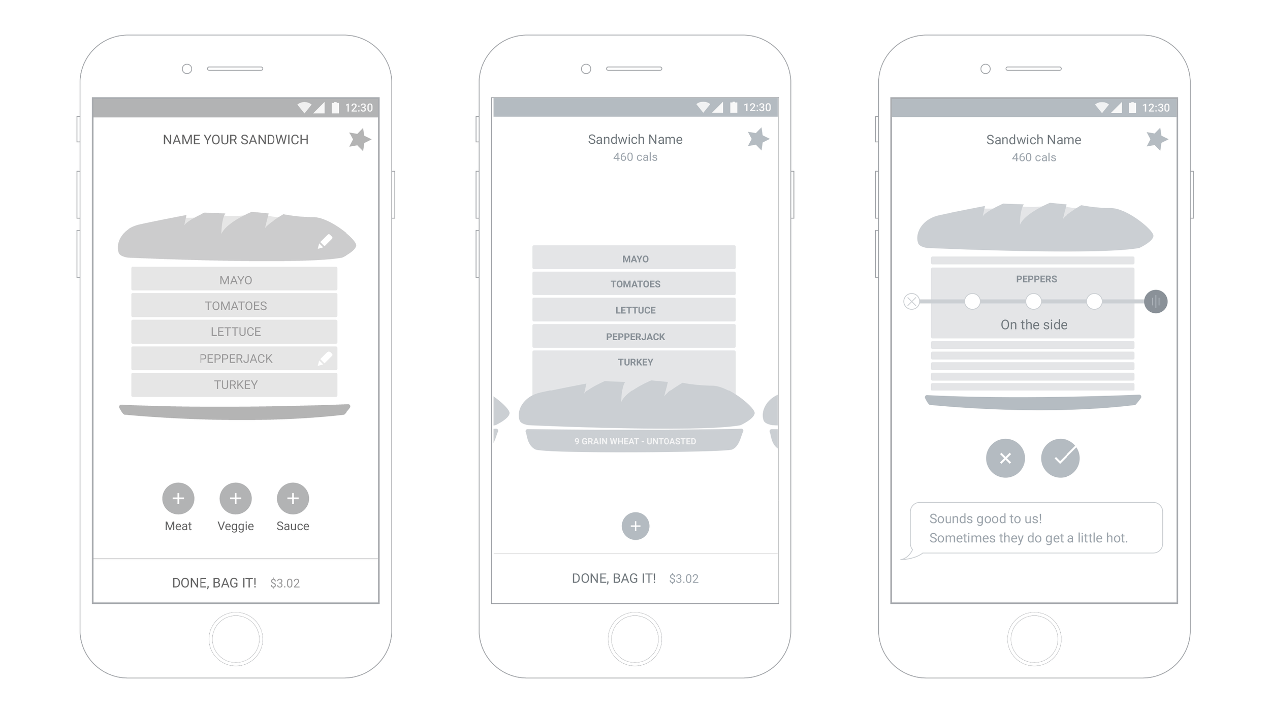
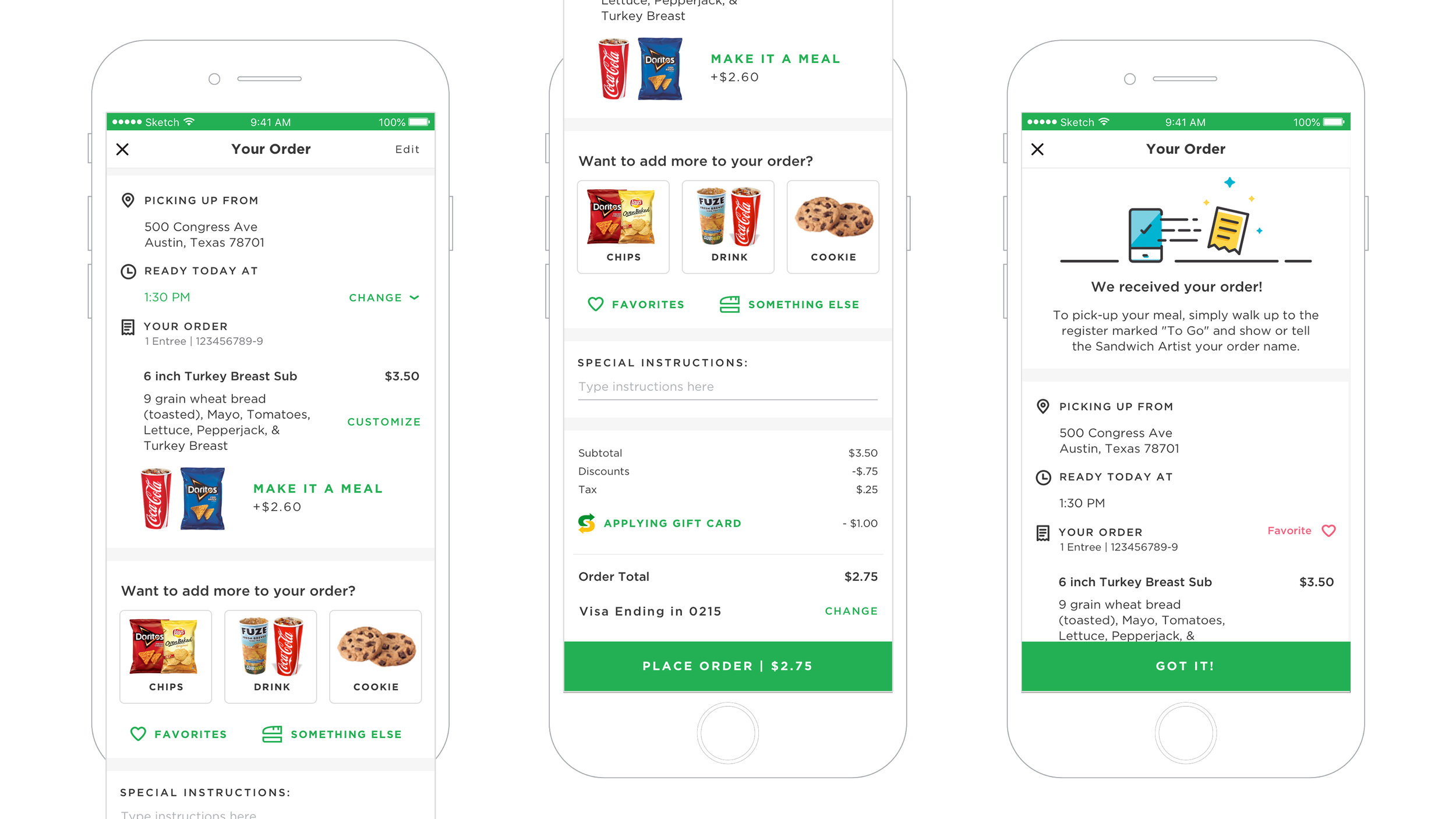
Throughout research, we came to understand that customers had an intense need to customize their sandwiches. We spoke with power users, looked at previous research, and analyzed thousands of actual comments received from their mobile ordering website.
Our client, on the other hand, wanted to teach their users to rely more on pre-created sandwiches. Acknowledging both of these extremes, we set out through tireless iterative design to create a flow that allowed a customer to do either.
As for customers that love our client for the flexibility, we wanted to retain that perk and give complete sandwich artistry to the user. Everything from stack order to moving freebies to the side. We allowed the customer to put an emphasis on what they cared about most.


“… if you don’t have a loyalty program, if you are not customizing, you are really behind the times. It’s not a question of leapfrogging the competition, it’s about beating the minimum expectations.”
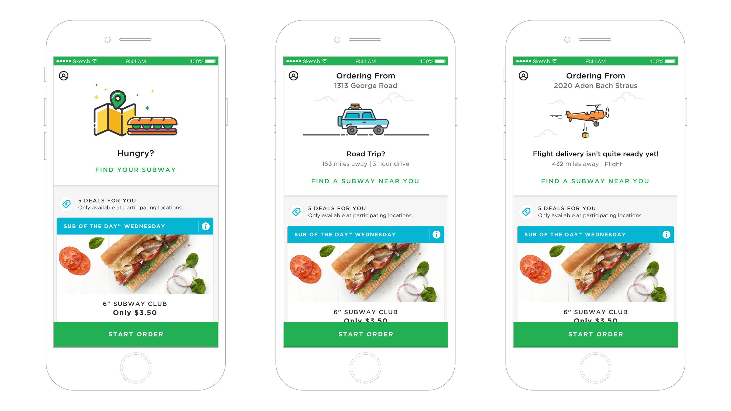
Finding the food
The concept behind location was to make the customer feel like they were always at the center of the experience, that any location was always simply around the corner (the largest QSR franchise in the world).
The default screen would show the user in the center of the map and the closest location. We used a card structure as a way to represent each location, with the first card representing the closest location. As the user swipes to the next card, the map would, in parallel, zoom out revealing the next location.


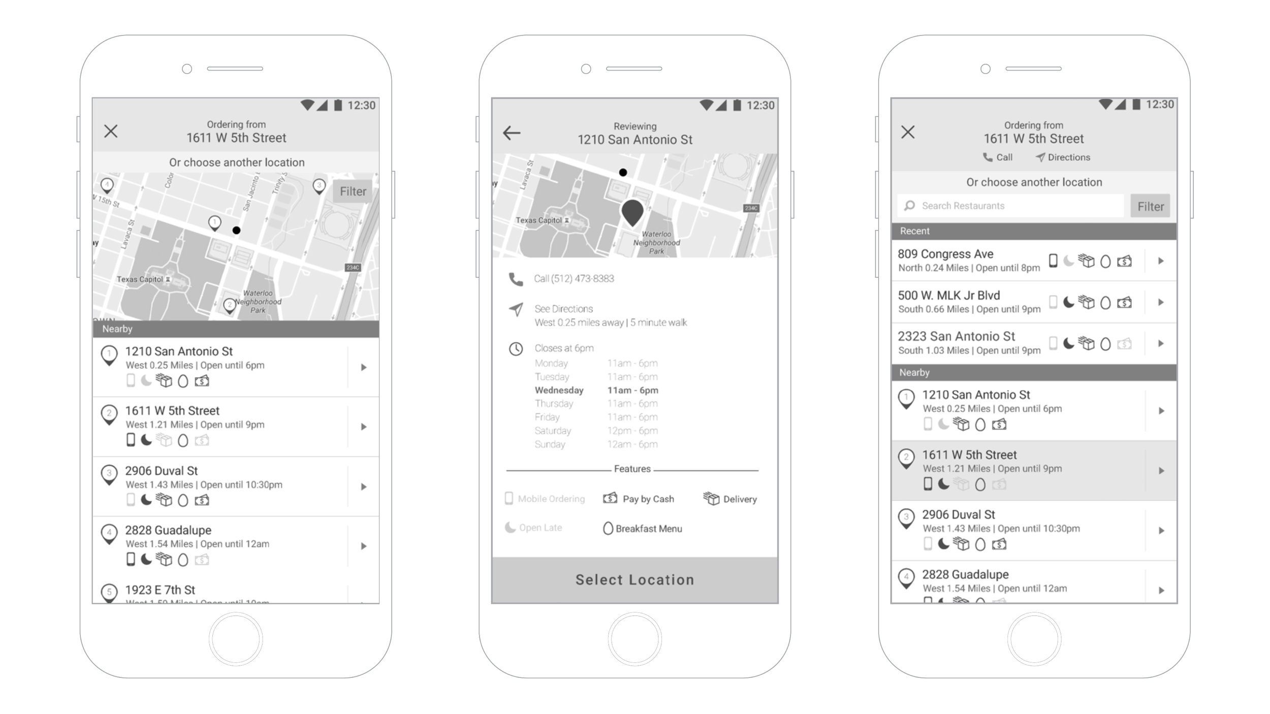
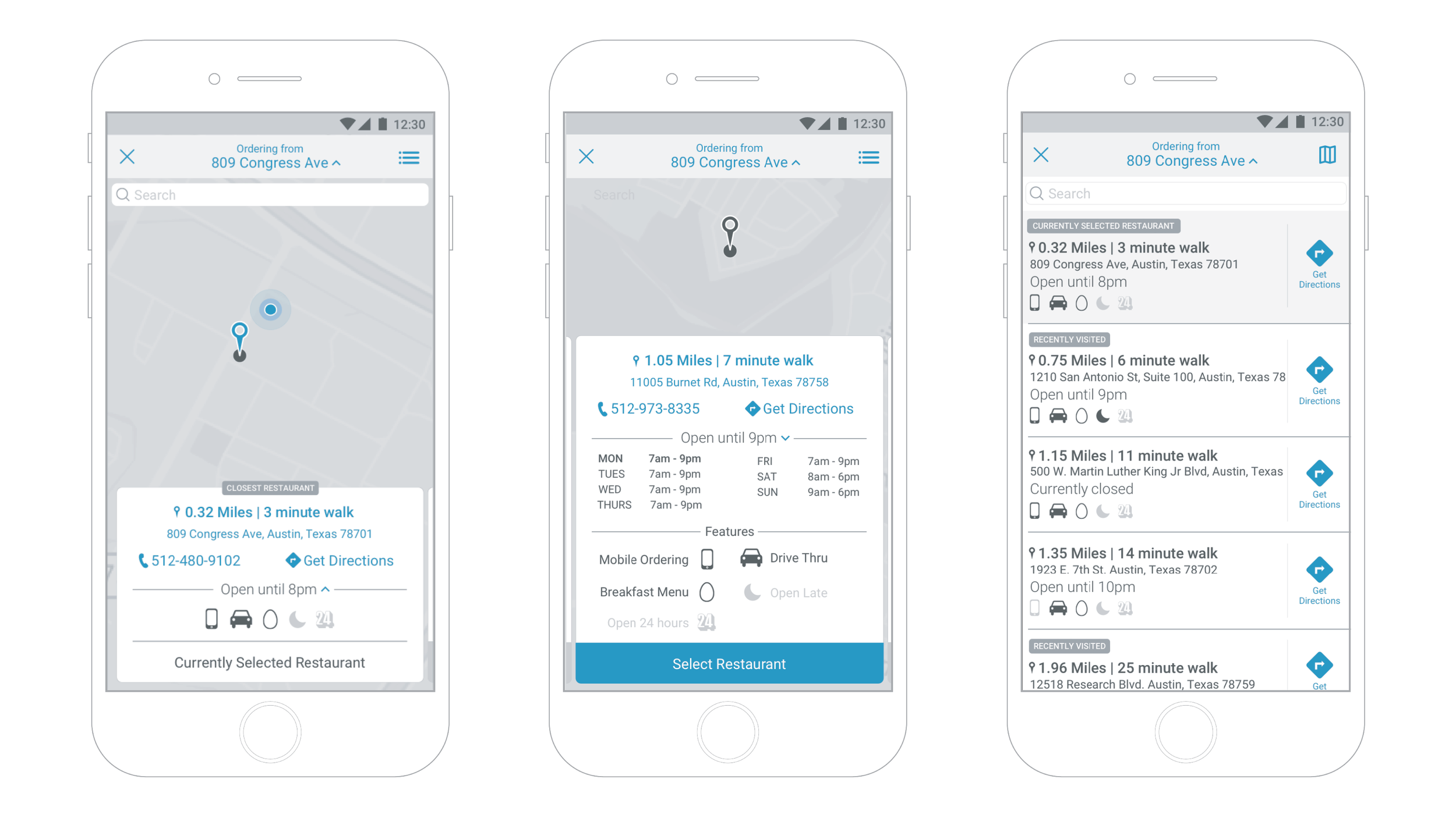
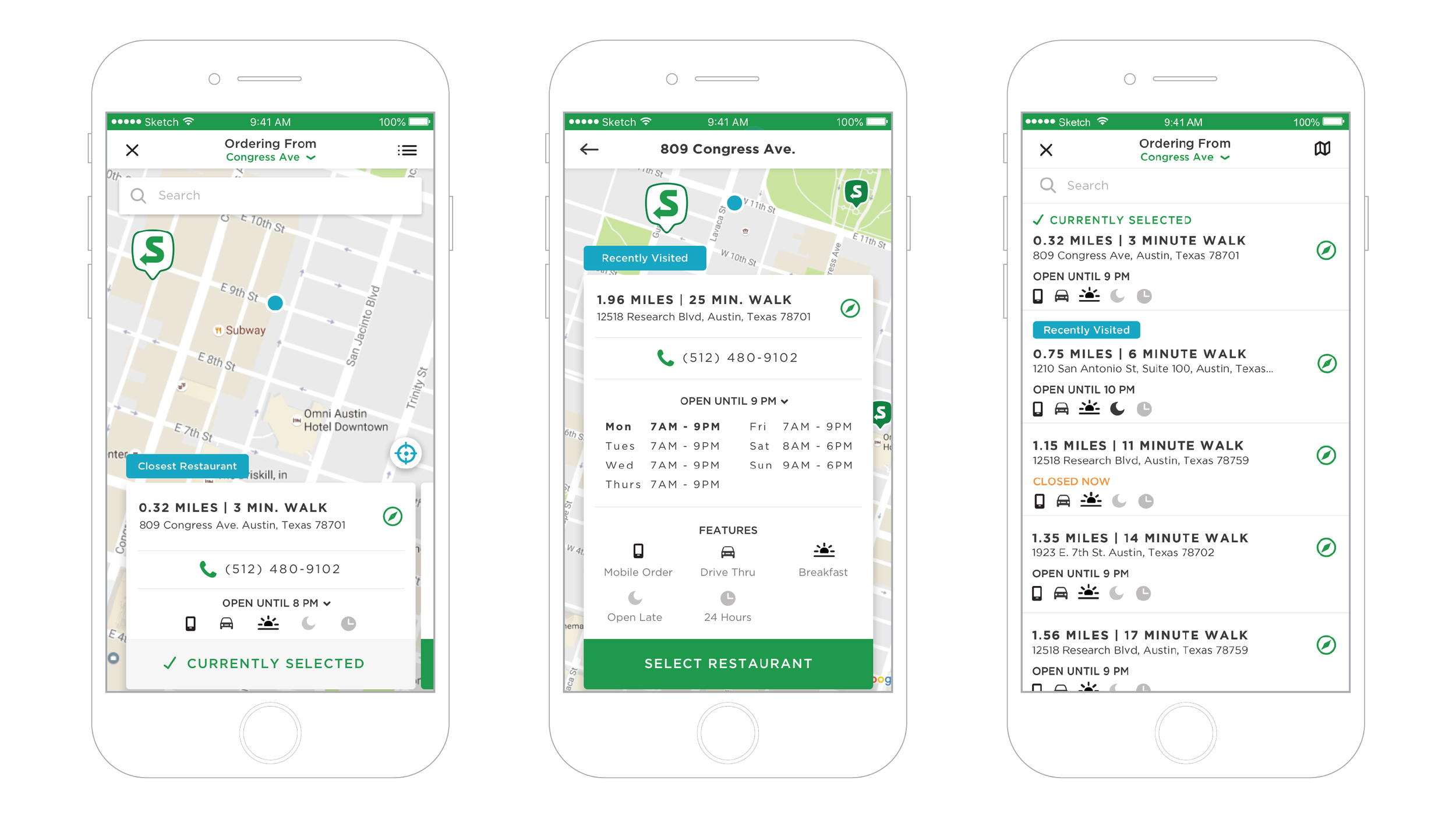
This being the default interaction, customers could also directly interact with the map to find other locations, change to list view, use a search tool with filters for location attributes, or interact with the card to see more information.
IMPACT
Though the app had a rough start upon release (The loyalty program was reset and was not available in the first release), the mobile app was a part of a larger digital plan. Our customer’s new digital infrastructure has increased loyalty members by 10x over the previous iteration of the loyalty program and digital ordering is up by 2x over what it was a year ago.

“...damn this app made me change my mind about this company. I work right next to a ... so I’m pretty much forced to eat it and on days when I’m slammed I can be in and out of there in less than a minute. Holy shit. Revolutionary guys. Good job.”
See More work